The colour scheme of your website is essential to developing a compelling and visually appealing online presence. The right colour selection can enhance brand identity, evoke emotions, and enhance user experience. This article will discuss important factors to take into account and offer helpful advice on how to choose the ideal colour scheme for your website.
Different emotions can be evoked by different colours. For instance, blue is frequently associated with confidence and serenity, whereas red can denote fervour or urgency. To match the colour scheme of your website with your brand identity and target audience, start by understanding the meanings and emotions connected to various hues.
Your website should reflect the identity and values of your brand. Take into account your brand’s logo, style guide, and collateral. To maintain consistency and strengthen brand recognition, align your website’s colour scheme with your company’s visual identity.
The colour scheme you select for your website depends on its goals. For instance, an online store selling eco-friendly goods might choose earthy hues and greens that are inspired by nature. A website that focuses on technology might use chic and contemporary hues like silver or blue. Match the colour scheme to the objective and audience of your website.
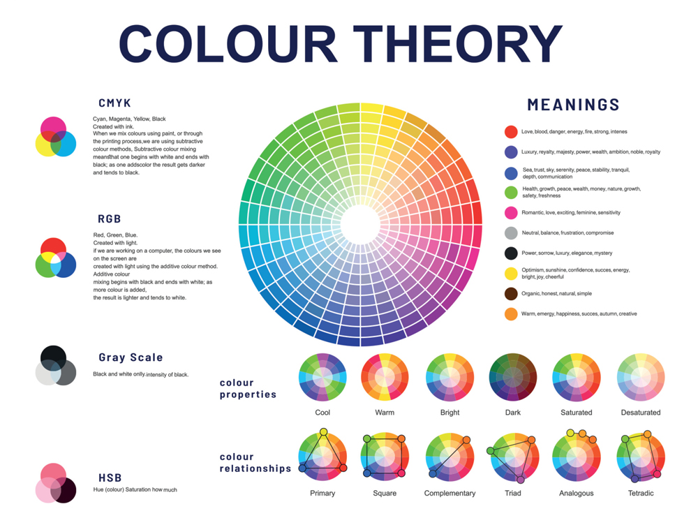
The colour wheel is a useful tool for choosing colour combinations. It is made up of circular arrangements of the primary, secondary, and tertiary colours. Here are some guidelines to keep in mind:
A. Complementary Colours:
To produce a vivid and eye-catching contrast, pick colours that are opposite each other on the colour wheel (for example, blue and orange).
B. Analogous Colours:
For a calming and harmonious effect, choose colours that are next to each other on the colour wheel (such as blue, blue-green, and green).
C. Monochromatic Colours:
For a refined and elegant appearance, stick to tints and shades of a single colour.
Make sure the colours you choose have enough contrast to make text legible. To increase accessibility, use colours for the background and text that contrast sharply. To ensure that your colour choices are readable for people with visual impairments or colour vision deficiencies, test your colour combinations.
Construct mock-ups or prototypes to see how your colour palette will appear in use. To try out various combinations, use design tools or online colour palette generators. Think about things like colour harmony, legibility, and overall visual impact.
An inclusive website must be accessible. Some users might be visually impaired or colour blind. Make sure your colour scheme doesn’t just use colour to communicate information. To make your website accessible to all users and supplement colour cues, use text, icons, or patterns.
For ideas, browse websites in your industry or other attractive websites. Make a note of the colour schemes and design components that speak to you. Make sure, though, that your colour scheme is distinctive and consistent with your brand identity.
Take into account asking your target market for feedback or conducting user testing. Get their feedback on the colour scheme and how they are affected by it. Their advice can help you hone your selections and make sure your colour scheme appeals to your target market.
Keep in mind that colours may appear differently on different screens and devices. To ensure consistency and prevent any unpleasant surprises, test your colour scheme across a variety of platforms and resolutions.
Selecting the appropriate colour scheme for your website has a big impact on the appearance, user experience, and identity of your brand. When choosing your colour scheme, you can make educated choices by understanding colour psychology, taking into account your brand identity and website’s purpose, and applying design principles like the colour wheel, contrast, readability, and accessibility. You can improve your decisions and make sure your website is coherent and aesthetically pleasing by testing new ideas, looking for inspiration from other websites, and getting user feedback.
Always keep in mind that the ideal colour combination should complement your brand, convey the desired feelings, and enhance the user experience. Aim for harmony between form and function, keeping in mind the tastes and requirements of your target market. To make sure your colour scheme is still appropriate and effective, periodically review and re-evaluate it.
You are prepared to start the process of choosing the ideal colour scheme for your website if you keep these suggestions and factors in mind. Allow your imagination and knowledge of colour psychology to lead you in developing a visually stunning and captivating online presence that successfully conveys your brand.
We would love to work with you on your next project or breathe new life into an existing one. Speak to our experts today!
Contact us