In a digital-first world, it’s easy to underestimate the power of print. But when done well, printed materials—such as brochures, flyers, business cards, and packaging—can leave a lasting impression that digital alternatives often can’t match.
With so much content competing for attention, how do you ensure your printed materials don’t get lost in the shuffle? In this blog, we’ll explore practical ways to make your print designs pop, convey your brand effectively, and drive engagement.
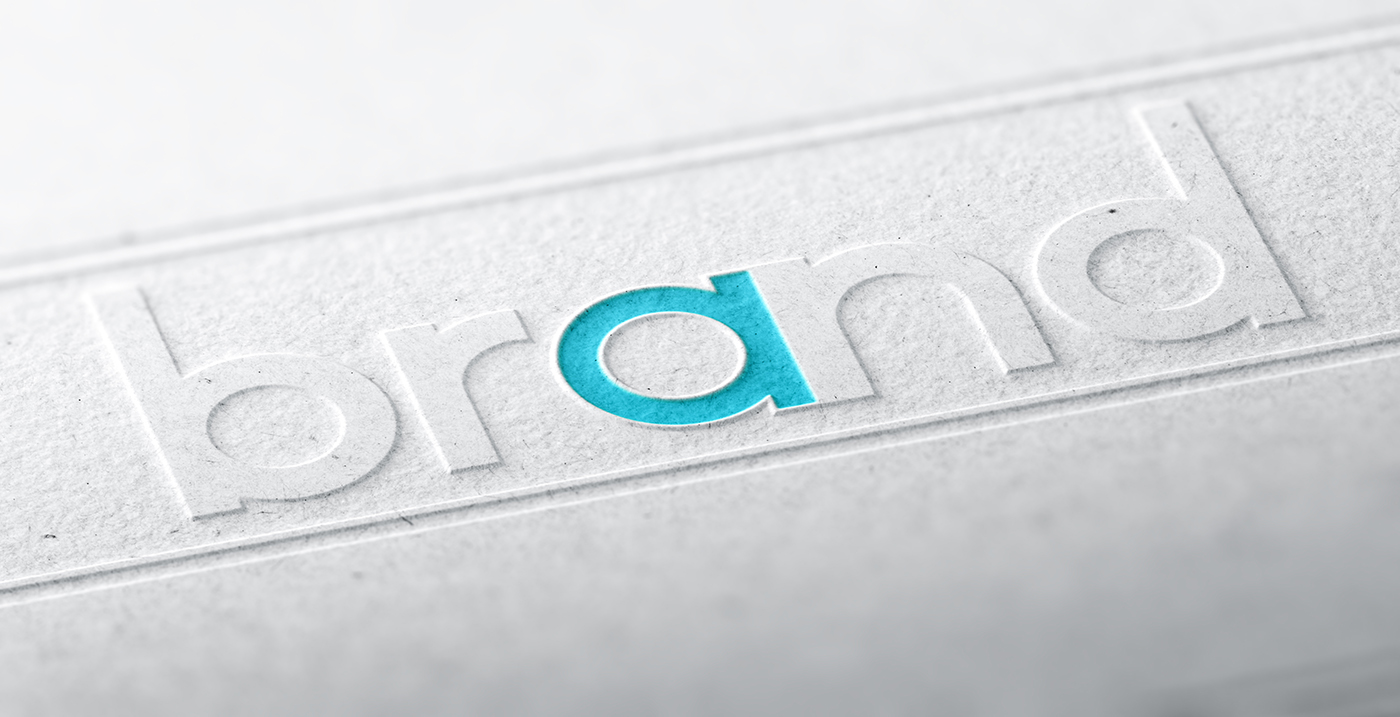
Before diving into design, it's vital that your printed materials reflect your brand consistently. That means using your brand’s colour palette, fonts, tone of voice, and logo in a coherent and recognisable way.
Your print should be an extension of your brand story. Whether you're producing a single-page flyer or a multi-page brochure, it should feel aligned with everything else you put out—from your website to your social media presence.
Tip: Create or revisit your brand guidelines to make sure all designers and printers are on the same page.
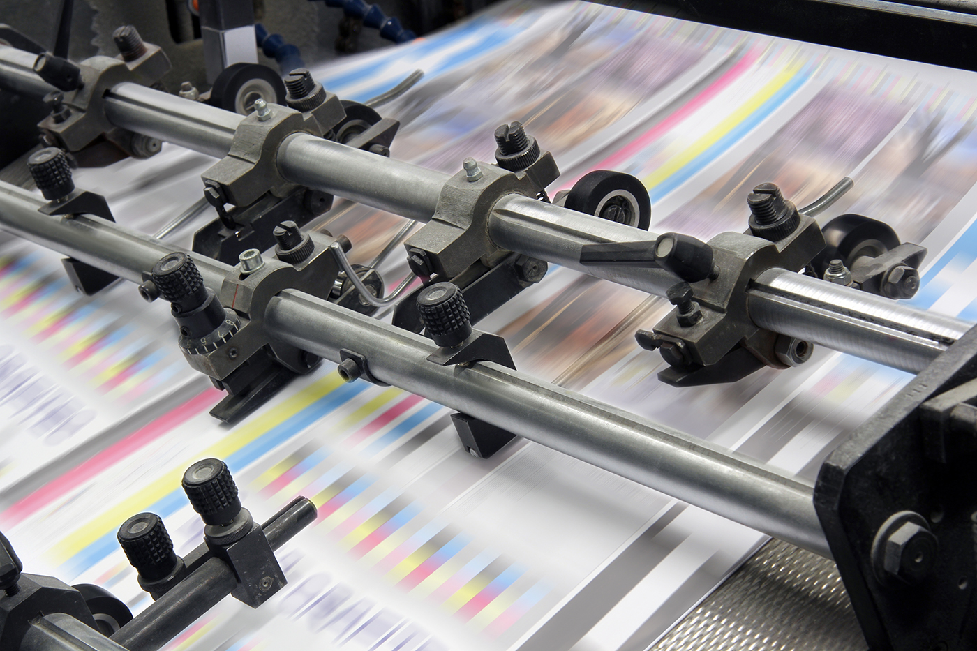
People notice quality. The weight, texture, and finish of your printed piece contribute to the overall perception of your brand. Thicker paper stock, matte or glossy coatings, and special finishes like embossing or foiling can make your materials feel premium and more memorable.
For example:
Tip: Always ask for paper samples or a printed proof before committing to a large print run.
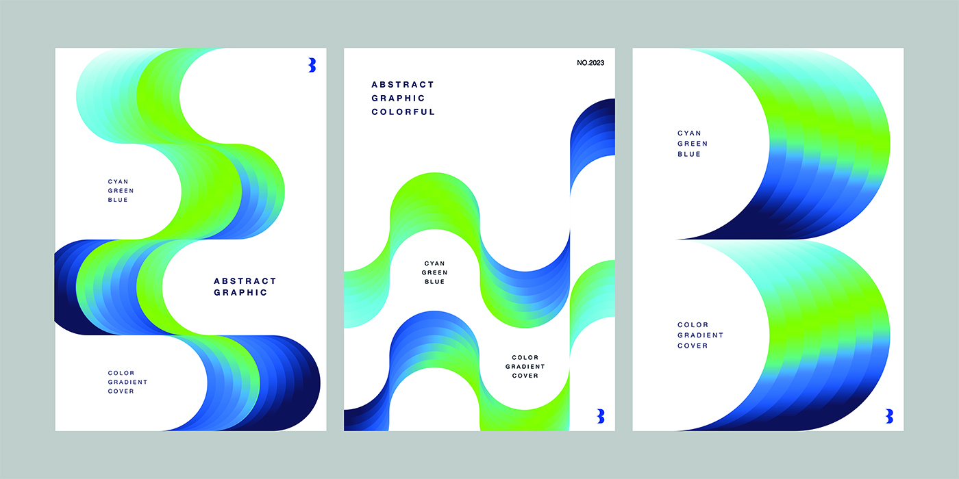
Good design guides the reader’s eye. A clear visual hierarchy helps ensure your message is received the way you intend.
Use typography, spacing, and colour to highlight key points:
Tip: Don’t clutter the page. White space is your friend—it helps your design breathe and makes information easier to absorb.
One of the joys of print is that you're not limited to rectangles. Consider experimenting with:
These elements add interactivity and surprise, which can capture attention and enhance engagement.
Tip: Balance creativity with practicality—ensure your piece still fits in standard envelopes or display holders if needed.
Textural elements make your design not just something to look at but something to experience. Finishes like embossing, debossing, spot UV, foil stamping, or letterpress printing create tactile interest.
These effects signal attention to detail and care—qualities your audience will associate with your brand.
Tip: Use these sparingly for maximum effect. A spot UV logo or foiled heading can go a long way without overwhelming the design.

Design grabs attention—but content holds it. Your printed materials should be:
Tip: Have someone else proofread before going to print—typos in print can be costly and undermine credibility.
Poor-quality images are one of the quickest ways to ruin an otherwise great design. Ensure all visuals are high-resolution and suitable for print (typically 300 DPI or higher).
Whether you're using photography, illustration, or iconography, make sure your visuals:
Tip: Avoid stock photos that feel too generic. Authenticity matters—use custom photography where possible.
Even in print, there are creative ways to make your materials interactive:
This adds a digital dimension to your print and gives people a reason to engage beyond the page.
While print can be harder to measure than digital, it’s not impossible. Use these techniques to track performance:
By understanding which materials drive action, you can refine your print strategy over time.

Print isn't going anywhere—especially when it’s creative, strategic, and well-executed. By focusing on quality, originality, and user experience, your printed materials can stand out and leave a lasting impression.
When done right, print enhances your brand in a way that digital channels alone simply can’t match. So don’t settle for “good enough.” Make your print pieces sing—visually, physically, and emotionally.
We would love to work with you on your next project or breathe new life into an existing one. Speak to our experts today!
Contact usGive us a call, drop us an email or complete our online form to discuss your new project and receive a FREE quote.