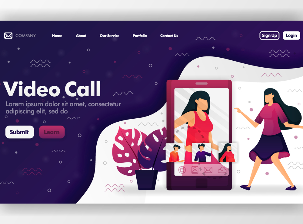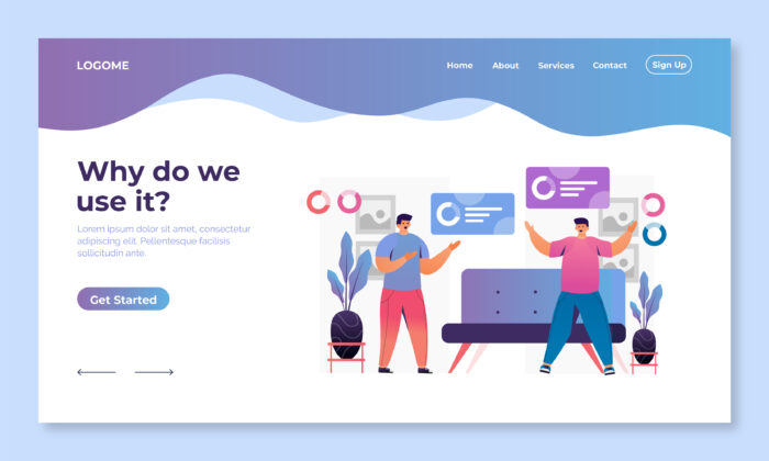
How to make a landing page that works well. An important part of any successful online marketing strategy is making a landing page that turns visitors into customers. A landing page is a web page that stands on its own and is meant to bring in leads or sales by giving visitors a specific offer or call to action (CTA). In this article, we’ll talk about the most important parts of a good landing page and give you tips on how to make one that turns visitors into customers.
When people come to your landing page, the headline is the first thing they see, so it’s important to make a good impression. Your headline should be clear and catchy, and the offer or value proposition should be easy to understand. It should also stand out and make people want to read more and take action.
Your landing page should have a simple, clear layout with a clear order of information. Avoid clutter and other distractions, and make sure the layout leads people to the CTA. Make the CTA stand out with contrasting colours and white space, and make sure the page is easy to navigate and looks good.
The text on your landing page should be short and convincing, making it clear what the offer is and why people should take action. Break up the text with bullet points, subheadings, and short paragraphs to make it easier to read. Use words that are convincing and focus on what the offer can do for the customer instead of what it looks like.
Social proof and trust signals can help build credibility and trust with visitors, making them more likely to take action. Use reviews, ratings, and testimonials from happy customers to show how valuable your offer is.
Show trust badges, security seals, and other signs of credibility to reassure visitors that their information is safe and that they can trust your brand.
The most important part of your landing page is the call to action (CTA). It should be easy to understand, short, and in a prominent place on the page.
Use language that encourages action, like “Get Started” or “Sign Up Now,” and make sure the CTA is easy to see. Use different colours, white space, and arrows to point people in the direction of the CTA.
A/B testing is the process of putting different versions of a landing page to the test to see which one works better. This can mean trying out different headlines, copy, design elements, and calls to action (CTAs). A/B testing can help you make sure you are getting the most out of your online marketing efforts and get the most out of your landing page.
With the number of people using mobile devices on the rise, it’s important to make sure your landing page is optimised for mobile users. Use a design that changes based on the size of the screen and makes sure the page loads quickly on mobile devices. To make it easy for mobile users to take action, use CTAs like “Call Now” or “Get Directions.”
When a visitor to your landing page makes a purchase, it’s important to follow up quickly and well. Use an email autoresponder or another strategy to keep in touch with leads and move them closer to making a purchase. Use tracking and analytics to find out how well your landing page is doing and where it can be improved.

Your landing page’s conversion rate can go up if you offer something like a concession or free trial. The incentive should go with what is being offered and be valuable enough to get people to act. Make sure the incentive is clear and easy to find on the page, and use persuasive language to get people to use it.
The speed at which your landing page loads is important for both the user experience and SEO. Slow-loading pages can cause more people to leave and less people to buy. To make a website load faster, you should optimise image sizes, use a content delivery network (CDN), minify CSS and JavaScript files, and use a hosting service you can trust.
Video is a great way to get people interested and show them how valuable your offer is. Use a short video that gets people’s attention to show off the benefits of your offer and get people to take action on your landing page. Make sure the video is optimised for different screen sizes and bandwidths and that it stands out on the page.
Personalization can help make your landing page more useful and effective. Use dynamic content and personalised messages to make sure the page fits each visitor’s needs and interests. Use information about visitors, such as their location, age, gender, and what they’ve done before, to make the experience more personal and increase the chances of a conversion.

In conclusion, an effective landing page that turns visitors into customers needs a clear and compelling headline, a simple and focused design, short and convincing copy, social proof and trust signals, a clear call to action, A/B testing, optimisation for mobile devices, and good follow-up and tracking. By using these tips, you can make a landing page that keeps visitors interested, builds trust, and leads to conversions, which will help you reach your online marketing goals.
We would love to work with you on your next project or breathe new life into an existing one. Speak to our experts today!
Contact us