
In today’s digitally dominated society, mobile gadgets have integrated seamlessly into our daily lives. Our reliance on smartphones and tablets has never been greater, from communication to entertainment, shopping to business transactions. The idea of “Mobile-First Design” has emerged as a game-changer in the digital environment as mobile usage keeps rising. The enormous impact of mobile-first design on user experiences, commercial success, and the overall development of the digital world is explored in this blog.
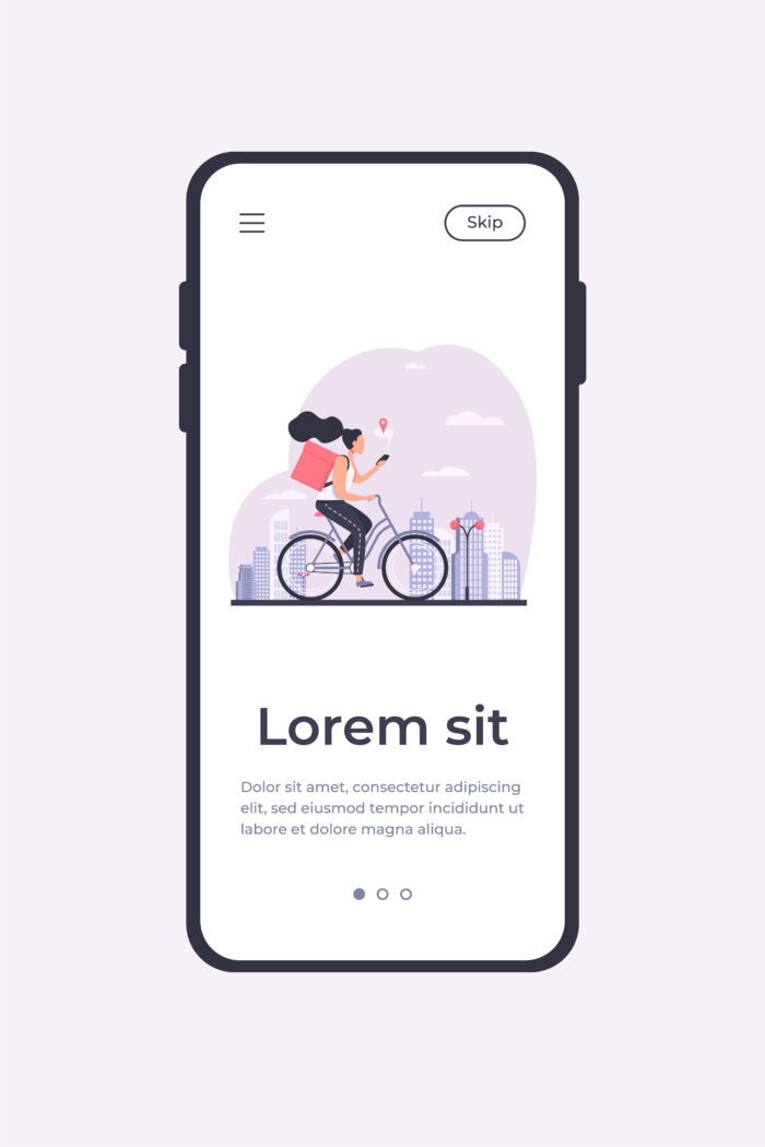
Prioritising the design and development of websites and applications for mobile devices before expanding them for larger screens like PCs or tablets is known as “mobile-first design.” Mobile-First Design begins with the smallest screen size, as opposed to the conventional desktop-first method, where designs are scaled down for mobile. Designers make sure that consumers on smartphones and tablets have a seamless and optimised experience by using the mobile-first mindset.
How consumers use the internet and interact with digital material has undergone a transformation thanks to mobile devices. Smartphones are now the preferred device for information consumption and engagement due to their portability and simplicity. Due to the fact that mobile usage has surpassed desktop usage, organisations must reconsider their digital strategies. This transition is acknowledged by mobile-first design, which aims to meet the demands and preferences of mobile users.

The core of mobile-first design is user experience. Designers may create intuitive interfaces, quicker load times, and user-friendly interactions tailored to the habits and preferences of mobile users by putting a priority on mobile experiences. Greater engagement, greater consumer pleasure, and greater brand loyalty are all fostered by this UX focus. Businesses that make the investment in mobile-first design benefit from satisfied clients who keep coming back.
Mobile-First Indexing is a response by search engines—especially Google—to the mobile-first environment. This indicates that Google predominantly ranks and indexes content using a website’s mobile version. Better SEO results benefit websites with a mobile-first design, which increases visibility and organic traffic. The adoption of Mobile-First Design by companies might give them a competitive edge in search engine rankings as a result.
Website optimisation for quicker loading times on mobile devices is encouraged by mobile-first design. Websites that load slowly drive off users who are on the go and result in increased bounce rates. Mobile-First Design improves overall user experience and lowers the possibility of visitors abandoning a website too soon by placing a priority on speed and performance. As a result, conversion rates are higher and users are kept around longer.

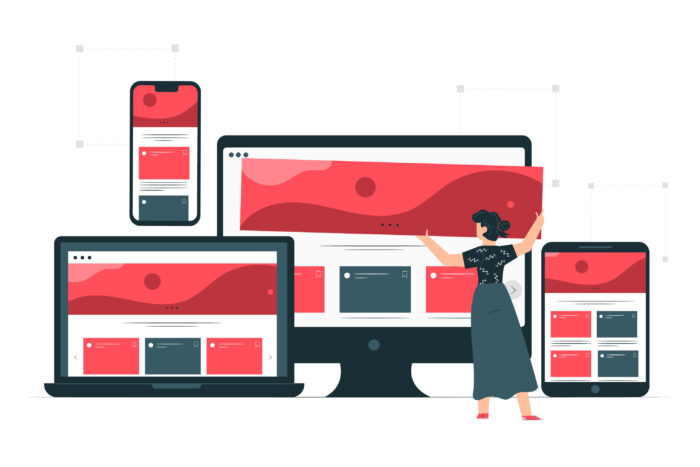
The idea of responsive web design, which makes sure that websites adapt fluidly to different screen sizes and resolutions, is complemented by the idea of mobile-first design. Starting with a mobile-first strategy enables designers to concentrate on a website’s key functions, resulting in a more effective and user-friendly design. In the changing digital environment, responsive websites that provide consistent user experiences across devices are more likely to be successful.
The e-commerce sector has changed as a result of the advent of mobile shopping. Optimised mobile shopping experiences are essential for boosting conversions and generating income, and they are made possible by mobile-first design, which is of utmost importance. Businesses who embrace a Mobile-First approach get a competitive edge in the mobile commerce industry as more consumers use mobile devices to make online transactions.
While Mobile-First Design has many advantages, there are also certain difficulties. When optimising for mobile, designers must take different screen sizes, resolutions, and operating systems into consideration. Prioritising content is crucial because there is a limited amount of screen area and information must be brief and pertinent. To create pleasant mobile experiences, functionality and simplicity must be balanced properly.
The relevance of inclusion and accessibility in digital encounters is highlighted by mobile-first design. Designers may guarantee that all users, including those with impairments, can easily access and engage with digital material by complying to the Web material Accessibility Guidelines (WCAG). The audience reach and user satisfaction are both increased by a truly inclusive design approach.
There is no denying the impact of mobile-first design on the online world. Businesses and designers need to adopt this strategy in order to provide excellent mobile experiences as mobile usage continues to dominate online interactions. Mobile-First Design, which prioritises the user experience while enhancing SEO rankings and enabling mobile transactions, propels corporate success in the ever changing digital landscape. The Mobile-First approach, which emphasises the value of taking into account the demands and preferences of mobile users, will continue to influence the digital landscape as technology develops. For companies looking to succeed in the quickly changing digital era, adopting mobile-first design is not simply a choice—it’s a requirement.
We would love to work with you on your next project or breathe new life into an existing one. Speak to our experts today!
Contact us