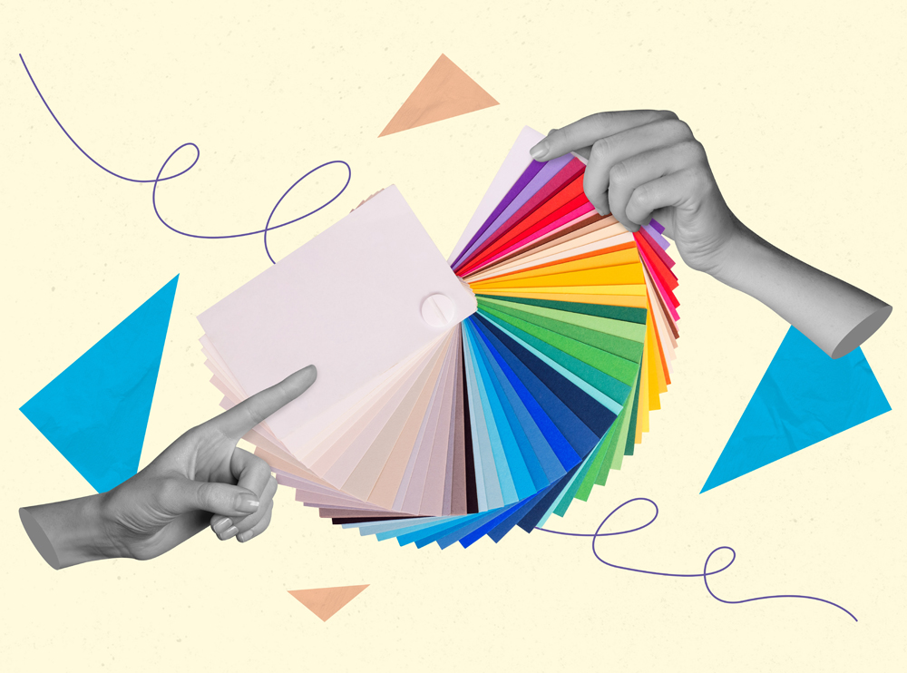
Colour is one of the most powerful tools in web design. It influences how users perceive your brand, navigates your website, and ultimately, decide whether to engage with your business. While many may view colour as purely aesthetic, it’s deeply rooted in psychology, with different hues evoking specific emotions and behaviours. Understanding the science behind colour psychology is essential for crafting a website that not only looks stunning but also effectively communicates your brand’s message and drives desired user actions.
In this blog, we delve into the fascinating world of colour psychology in web design and explore how you can harness its power to create more impactful digital experiences.
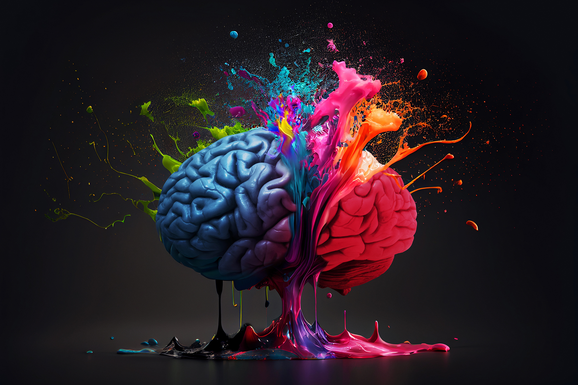
Colour has a profound psychological impact on how we interpret and interact with the world around us. When users visit your website, the colours you choose can shape their first impressions in milliseconds. Research shows that colour increases brand recognition by up to 80%, making it a critical component of your online presence.
Colours can:
By understanding the psychological associations of different colours, you can craft a web design that aligns with your brand identity and appeals to your target audience.
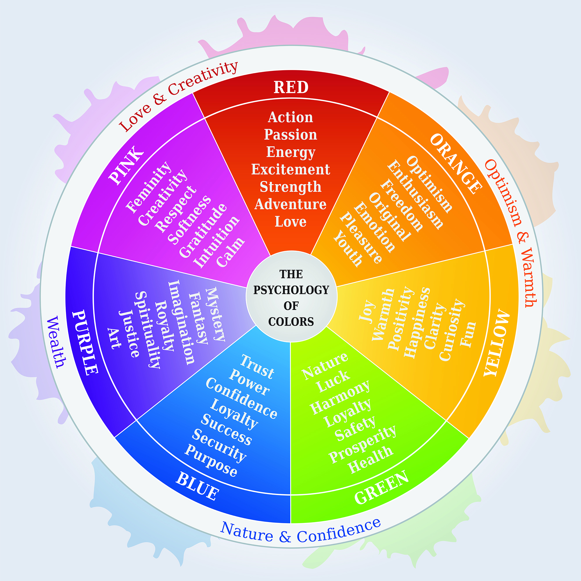
Every colour carries its own set of psychological associations and emotional triggers. Here’s a breakdown of the most common colours used in web design and what they typically convey:
Red
Blue
Green
Yellow
Orange
Purple
Black
White
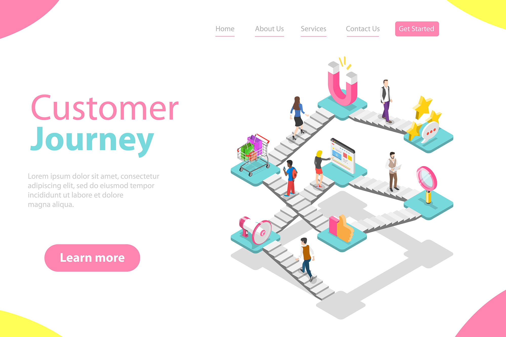
Colour isn’t just about aesthetics; it’s a powerful tool for influencing user behaviour. By strategically selecting colours, you can guide users through your website and encourage specific actions.
Call-to-Action Buttons
CTAs are one of the most critical elements on any website, and colour plays a vital role in making them stand out. Colours like red, orange, and green are often used for CTAs because they grab attention and encourage action. However, the key is to ensure the CTA contrasts with the surrounding design while still aligning with your brand’s colour palette.
Navigation and Hierarchy
Colour can also help users understand the structure of your website and navigate it with ease. For instance:
While colour psychology provides general guidelines, it’s essential to consider cultural and contextual differences when designing for a global audience. Colours can have varying meanings across cultures. For example:
Understanding your target audience’s cultural background will help you make colour choices that resonate universally or adapt to specific markets.
Achieving the right balance of colour is crucial for creating a cohesive and visually appealing website. Here are some tips for effective colour usage:
The 60-30-10 Rule
This classic design principle involves using:
This approach ensures harmony while adding enough variety to keep the design engaging.
Contrast and Accessibility
Contrast is essential for readability and accessibility. Ensure there is sufficient contrast between text and background colours, especially for users with visual impairments. Tools like colour contrast checkers can help you meet accessibility standards.
Many brands have mastered the art of colour psychology to create memorable websites and drive user engagement. Let’s take a look at a few examples:
Selecting the right colours can be daunting, but several tools can simplify the process:
Colour psychology is an invaluable aspect of web design that goes far beyond aesthetics. By understanding the emotional and behavioural impact of different colours, you can create websites that resonate with your audience, reinforce your brand identity, and drive meaningful engagement.
Whether you’re designing a playful e-commerce site or a professional services platform, the right colour palette can make all the difference. Keep your audience, cultural context, and brand goals in mind, and let colour work its magic to elevate your web design to new heights.
We would love to work with you on your next project or breathe new life into an existing one. Speak to our experts today!
Contact us